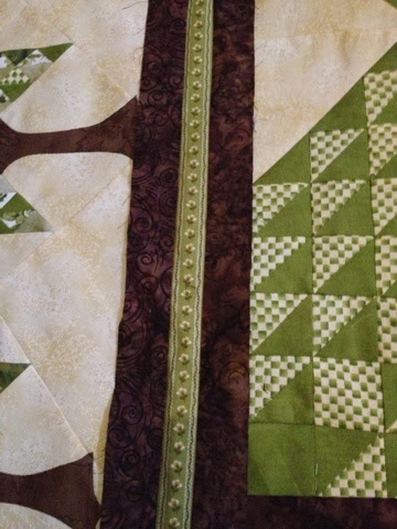
I've made up three choices and I'm undecided about two.
We all liked the gold but maybe I made it too thin?
I didn't think I liked the green but now I'm not sure. It really isn't too bad either.
The green isn't the same exact shade as the trees but they do play well together.
So if you have an option, please tell me! Because I'm really at a loss!
We all liked the gold but maybe I made it too thin?
I didn't think I liked the green but now I'm not sure. It really isn't too bad either.
I don't think I like the stripe but that could be because it is too wide?
And the color doesn't seem to add anything to the quilt. The green isn't the same exact shade as the trees but they do play well together.
So if you have an option, please tell me! Because I'm really at a loss!
Have a wonderful weekend!
Take care, Brandie


10 comments:
I love your quilt. I think the green one is my favorite.
Oh WOW! Getting better all the time! You're right, what bothered my about the green was the shade, but set in the border I like it! Allot :0) The gold is my least fav now, yes, too thin and the stripe looks OK from a distance.
The green stripe is the perfect width and it pulls in the new fabrics you added in the little trees. Green imho
Of the 3, I like the green best. The gold might look a lot better of it was a lot wider, but I don't know how big you want to make your quilt.
Ok, I had no idea that you were using brown in the border as well. Like the green much better. Better proportions and I like the color.
Eeeny, Meeny, Miney, Mo!
Okay this is why making a mock-up is important. I definitely change my vote and throw out the gold. I actually really like the green with the brown. Well Done Dear...
Another vote for the green
green
Very nice trees. Love the trunks. I like the green. Thanks for sharing.
LOVE the green!
Post a Comment